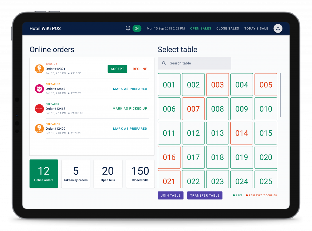
A rise in the restaurant industry led to managing the orders efficiently and provide hassle-free experience to their customers. Managing all dine-in and online orders of a restaurant in a simple and efficient manner while maintaining the transparency of all the transactions was the biggest challenge along with providing high usability to the system users who are not highly educated and working in a restaurant(s) as employees/cashiers.
Wiki POS system was mainly designed for handling complete end-to-end order management, either offline or online. While building this, I used the design sprint approach from doing effective user and industry research to deploying the platform in some of the bigger restaurants in India and Indonesia.
My role was to undertake early market research and to conduct client and stakeholder interviews along with running the UX design sprints and design the solutions as needed.
User research, User journey, Task flows, Interaction design, Visual design, Prototyping and Testing
It is crucial for the restaurants to manage all of its offline and online orders efficiently and in real-time to provide a seamless and effective experience to its customers. Managing all the orders with taking care of the effective communication between the different sections of a restaurant without creating a chaos was one of the biggest challenge. Punching in incoming orders, sending end-to-end order updates, keeping track of the active orders and managing the restaurant customers has to happen in a real-time environment.
Another challenge(especially in India), by doing a user research, we found out that the restaurant employees who works as cashiers or counter managers, are not highly educated and needs to go through training to use the existing(or newly launched) software available in this restaurant management software business. This was also one of the major examples to leading towards a chaos if at all there occurs any human error in using the system.
By doing a competitive study, we also found out that, there is a need to provide a simple, clutter-free and efficient POS system to enhance the user experience so that the restaurants focus on what actually matters – their food and the service!
In order to understand the user behavior and to understand how the restaurant industry works in its day-to-day operations, I conducted client interviews and employee interviews i.e. interviewed restaurant owners and cashiers to get some information about the same, for user and relevant research. I also did an on-field study to understand how the things actually work on the ground and what is the reality behind providing a good restaurant service and how the orders, inventory and other parts of the business are getting managed in real-time. I also did a competitive study on the existing software they were using and how it was beneficial as well as frustrating in some management areas at the same time.
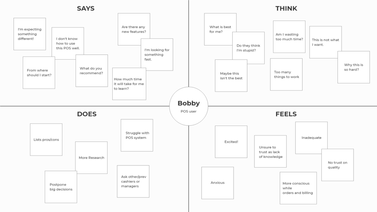
Based on the client interviews and employee interviews, we found out some of the important pain points the users made as a statement they are currently dealing with,
- “My restaurant manager need to educate a new cashier when appointed for using POS. Sometimes, it takes more than 2 weeks to fully educate the newly appointed cashier.”
- “I’ve lost the previous month’s orders data. I cannot track those transactions and I need this transparency to avoid any loop holes.”
- “Once the system goes offline, we have to carry out our operations manually on paper.”
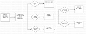
- “We have to manually modify the order if there’s any change in an active order or any cancellation of an item in an order. It is a very difficult task to do and the system doesn’t let us modify the existing orders.”
- “Sometimes, we have to put the system on hold and all the orders on hold when there’s a rush in our restaurant and there are a lot of active orders running. This sometimes creates miscommunication between chefs, waiters and cashiers.”
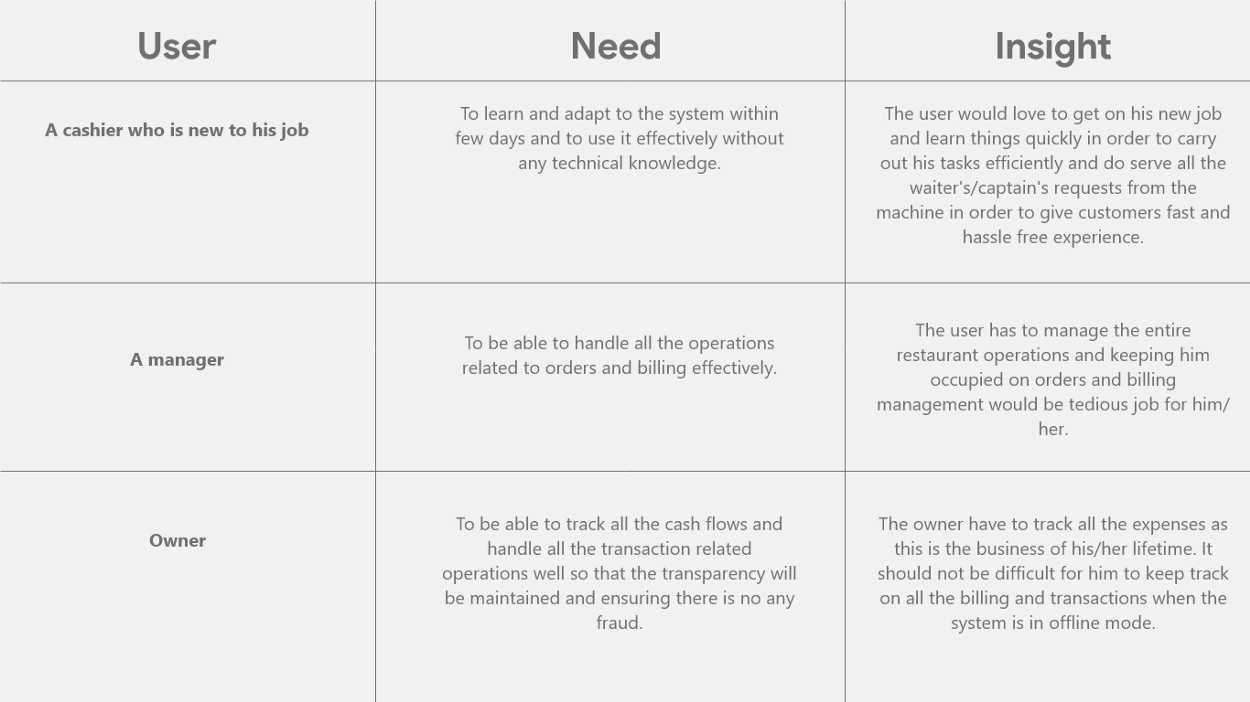
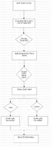
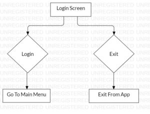
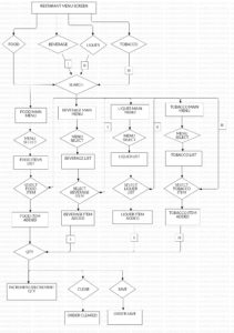
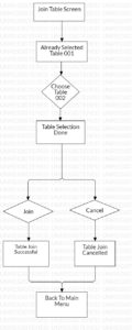
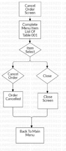
After analyzing all the problems, I started working on creating the task flows that helped me in designing the simplified solutions and how the user will interact with the system that can be simple, clutter-free and easy to use. These task flows defines each and every task of the POS system that need to be carried out efficiently and in real-time.
After this, for creating a final workflow and the POS design, I’ve used the S.C.A.M.P.E.R. method to help innovate existing product, service and situations by putting it out in these 7 different lenses,
I substituted number of screens that are not intended to have a separate screen (for hold bill, cancel order, modify order, apply discount, select table, tax, payments, customer records, daily accounts and so on) and tried to integrate them on the same screen so that, user mainly focuses on the ordering and billing by utilizing all of the above options as and when needed to complete their task.
As I did substitution, I obviously combined these operations on one screen as there was enough real estate for me to show case all of these options on it. I combined them in terms of meaningful dialog modals that gives the progressive disclosure of the UI.
As I had carried out the market research earlier, I’ve adapted to the available systems in terms of the feature discovery and I’ve also kind of picked some of the best features current systems in the marketplace are providing (for ex. changing the status of the system as and when it switches in either offline or in online mode).
I modified the layout structure we’ve analyzed in the existing POS systems which is quite complex and cluttered. I focused on providing a simple, effective UI that will help in increase the speed of the operations and frequency of use.
I’ve reused most of the design components while designing the UI to make sure to repeat the similar design patterns that user will get familiar with very easily.
I eliminated the unnecessary screens that we found out while doing the usability study of existing POS systems and I worked on how to either minify such operations or eliminate their existence completely if it is not useful.
I rearranged a lot of secondary operations that will occur on screen to prioritize billing and ordering tasks that will help users focus on their main priority tasks without having to worry about the less frequent operations.

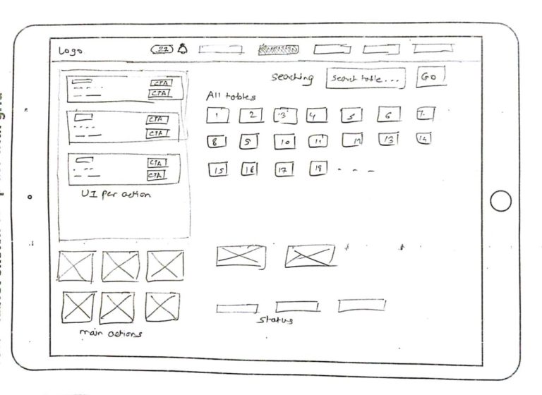
I created a lot of initial sketches for providing a solution after deciding on the final user flow to create the low-to-high fidelity wireframes. We did go through multiple iterations of low-fidelity wireframes in order to design an MVP of a solution. And, as we adopted to the design sprint process, we decided to do the user testing on wireframes on a weekly basis in an agile manner.
Once we finalized a solution by doing some early usability tests, I designed the high-fidelity prototypes which were then tested and decided to do the design-handoff to the engineering team for the development of these prototypes.
Below are some of the early design sprint sketches I did while working on Wiki POS.
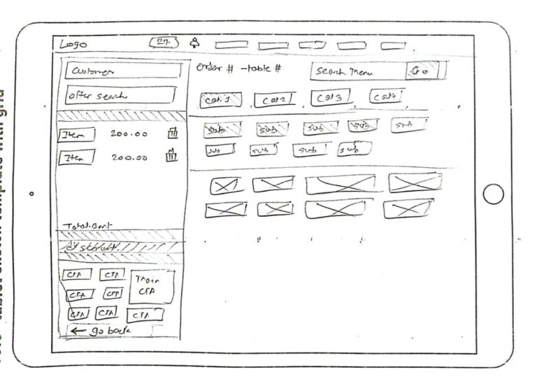
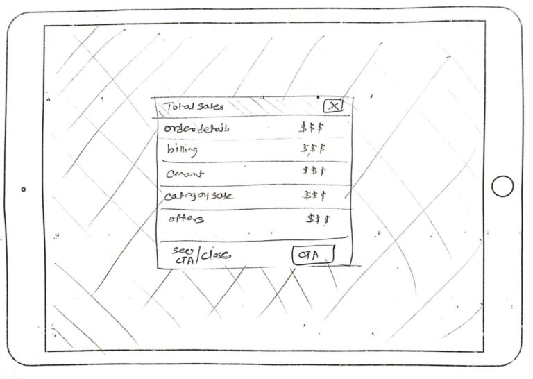
Based on the iterative wireframing and the workflows, I divided the POS in two main screens with having all of the above workflows as dialog sections that carry these functionalities. I’ve mainly focused on utilizing the real estate, mainly on order and billing management and added all the relevant sub-functions based on the requests the cashier user is currently facing. This helped the users to provide simple, fast and clutter-free experience.

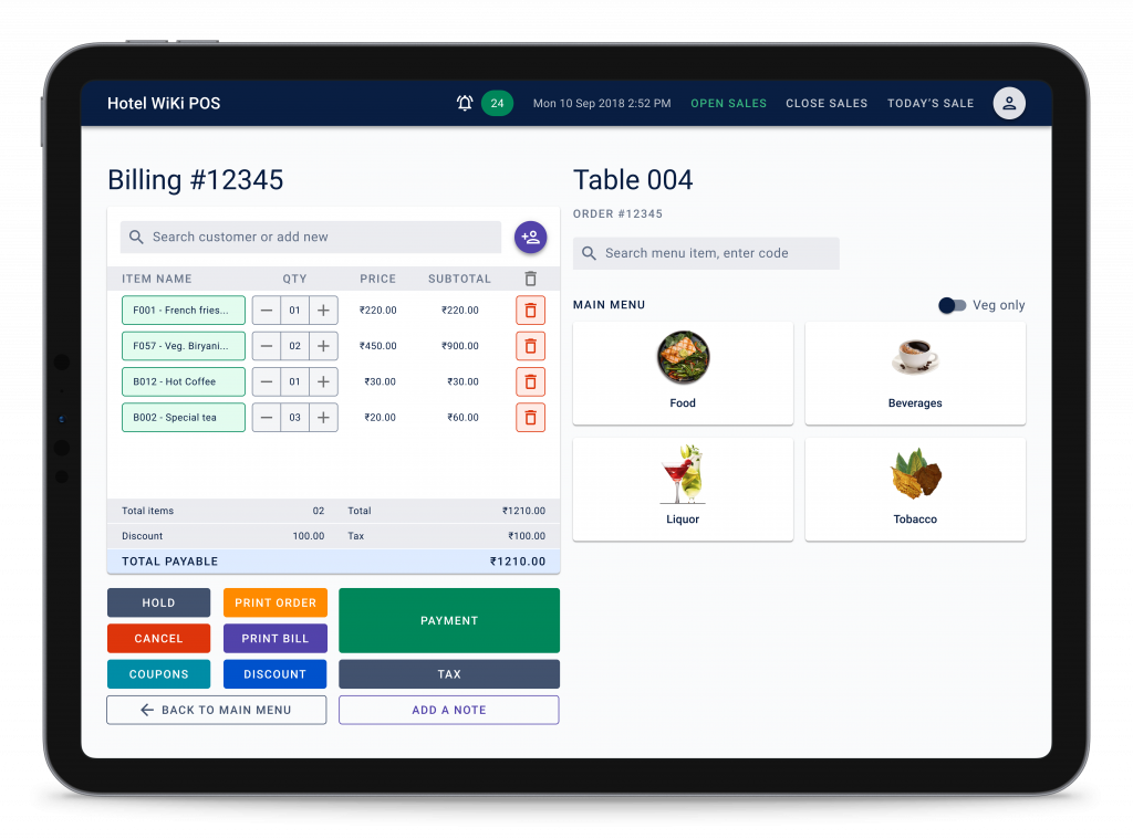
As I mentioned, I have added all the relevant sub-functions on these orders and billing main screens on a set of dialogs that helped users to navigate through different actions and functions easily and quickly. You’ll see the all these orders and billing sub-functions on the design prototype I presented below,
We tested wireframes and prototypes created in a design sprint process and we rigorously tested them each week in our design sprints. Based on the same, we found out some of the qualitative insights,
- In my initial wireframes, all of the actions of the sub-functions such as hold sale, payment, tax, discount, etc. were all having the same color and it was pretty confusing for the users because of too many actions (which were needed) having the same color and was deflecting them from completing their certain task at a time. Based on this, we decided to give different colors to these sub-function actions in our latter high-fidelity wireframes.
- There were some other challenges based on the whole Smart Wiki system which was built around the restaurant industry and POS is just one module from all the other modules the company was selling at the marketplace. There were some issues related to some of the actions that directly or indirectly communicates with Wiki back office which was mainly designed for the owners and they wanted to enable/disable some controls from their end to the POS.

We released Smart Wiki solution (the complete solution along with Wiki POS module) in some of the premium restaurants situated in Pune, Bali and Singapore and we got some amazing feedback,
Order and billing management of the Wiki POS made our jobs easier and we also loved its integration with the back office gave us the fast and simple experience.
- In this, I understood that there is no such thing as too many iterations, I worked on different wireframe iterations on a weekly basis based on the design sprint method the team used.
- Working together with the engineering team empowered me to learn and empathize about how they work on such complex product. I got to learn a lot from them about the exclusivity and how to control any platform in a module-based environment.
- It also added one more thing in my learnings and that is, “If you’re done with the testing, test more!” You’ll always find new things and new problems to work on.
Feel free to reach out to me if you’re thinking about hiring me or would like to discuss your idea.

