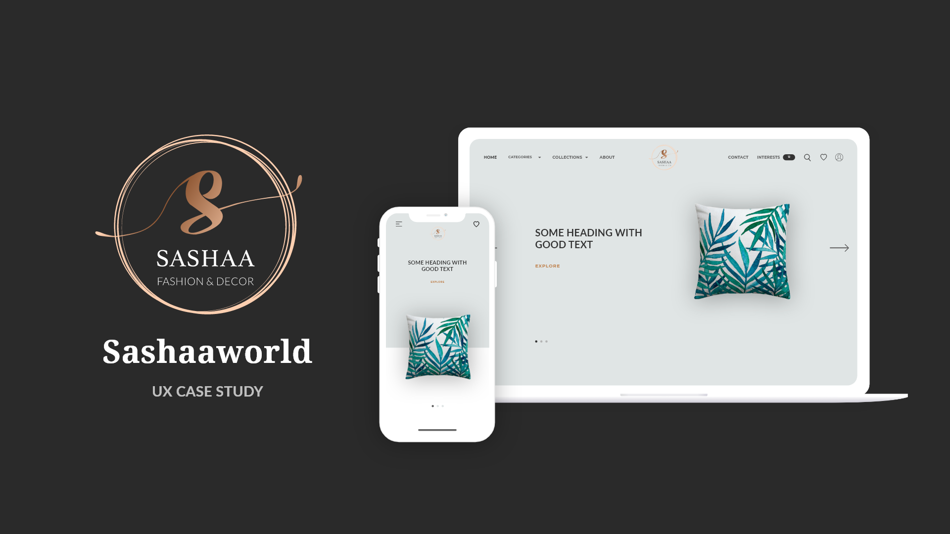
There’s a flood of e-commerce websites that provides every single feature that any e-commerce website should have, but the challenge was bringing the customers on to this new early phase, ready-to-be the e-commerce website called Sashaaworld (with it’s unique Express Interest feature), which is all about Indian-made furnishing products to be made available especially for its customers in Singapore. So, the main problem I was solving while making this design is to give clear ways for locating products, collections and categories, efficient means of expressing their interests in the products they love for purchasing the same products when they’re available on the website and steering customers towards popular products in the domain of Furnishing.
So, I adopted a Mobile-First design approach for making this e-commerce website as, most of the people checkout the products on mobile (on-the-go) and also are usually overwhelmed with a lot of shopping apps available on their phones. So, using this approach also helped me in making fully-responsive, context-first and task responsive web design.
My role was to build a fully-responsive e-commerce website design from scratch, carrying out the UX and UI design activities, by working in the 5 phases of UX design i.e. Empathize, Define, Ideate, Prototyping and Validating in a non-linear fashion.
Empathize
In this phase, I’ve carried out the User Research methods in order to understand what the customers really want from every e-commerce website according to them and also included empathy maps in order to understand e-commerce users better. I’ve also created Affinity maps to bundle or group the users’ needs together.
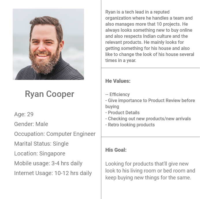
User Personas
I’ve presented some of the fictional personas to understand each user’s goals, motivations and their behavior while shopping.
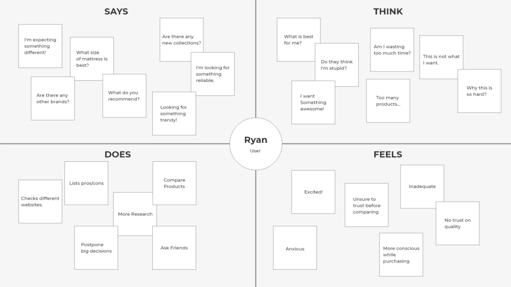
Based on the user personas, I’ve also done creating the empathy maps that actually differentiates between what user actually said, did, thought and felt before buying any new furnishing products online.
Empathy Maps
Empathy maps were actually helpful in understanding what the user really want and also helped me in defining the actual needs of them while also considering the need of the client.
Define
In this phase, I’ve analyzed and synthesized the users’ needs and also finding out what user actually want by defining my POV (Point of View)based on the personas and Empathy and affinity maps created. I’ve created some of the POV madlibs that are mentioned below,
“An adult person who lives in a city,needsto constantly change the look of his living room,becausehe wants to make his house look good when his relatives visit her house.”
“An old lady who has retired from furnishing industry, wantsto gift something unique to her children without investing much time in long transaction processes, becauseshe knows what will be good for them and also how it will help design the house.”
I’ve also asked set of “How might we?” questions to myself for carrying out designing minimal and appropriate website design that’ll help the needs of the people. Some of the main questions were,
How might we showcase all the products at a glance?
How might we make it simple to get access to the featured products?
How might we make checkout process faster?
How might we take a user directly to their specific/interested products?
Finally, I’ve defined the primary needs,
Organizing products clearly and simply for seamless product search.
Showcasing new arrivals and featured products at a glance.
Customer brand relationship as main priority to build a trust.
Efficient checkout process to save user’s time.
Product reviews for informing users about the product and giving the social proof.
Ideate
In this, I’ve started ideating the solutions to the problems/needs defined by defining set of ideas that’ll work. Before that, I’ve also carried out competitor analysis in order to understand the latest trend in online furnishing market and to gain relevant insights for my e-commerce website design.
Competitor's Analysis
I began to find out the 3 best online furnishing stores from Singapore, analyzed what they’re providing. The most direct competitors was Crate & Barrel, HipVanand Castlery. My main objective was to compare and identify the common features they’re providing and potential opportunities to set Sashaaworldto differentiate itself.
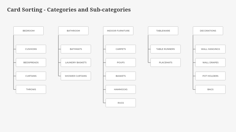
Information Architecture
The next step of my process was to develop navigation system by conducting a card sorting, a method used to tap into people’s existing mental models. For this project, I had around 3000+ products that need to be categorized in a clear and understandable way so that the visitors would find their desired products easily on the website.
Based on the card sorting results, I’ve categorized and sub-categorized products into 5 main broad categories and approx. 3–5 sub-categories inside each category and got approved from the client for showcasing all products on the website in the same fashion. I also tested these categories (sub-categories too)and found out that those were the logical categories to the majority of users. Thus, I move forward in my designs with the same.
Prototyping
After defining the user flows and sitemap for the website, I’ve started designing a low-fidelity prototype using pencil and paper. I’ve designed main screens first, again in Mobile-First approach where I’ve carried out the mobile web designs first and then moved on to making desktop web designs.
Prototyping Further
Once I’ve gone through the iterations of sketches for finalizing the designs, I’ve started with High-Fidelity prototypes due to the stringent deadlines to achieve and also to show the clients and customers the design by sharing the prototype. I’ve used Adobe XD for designing and prototyping.
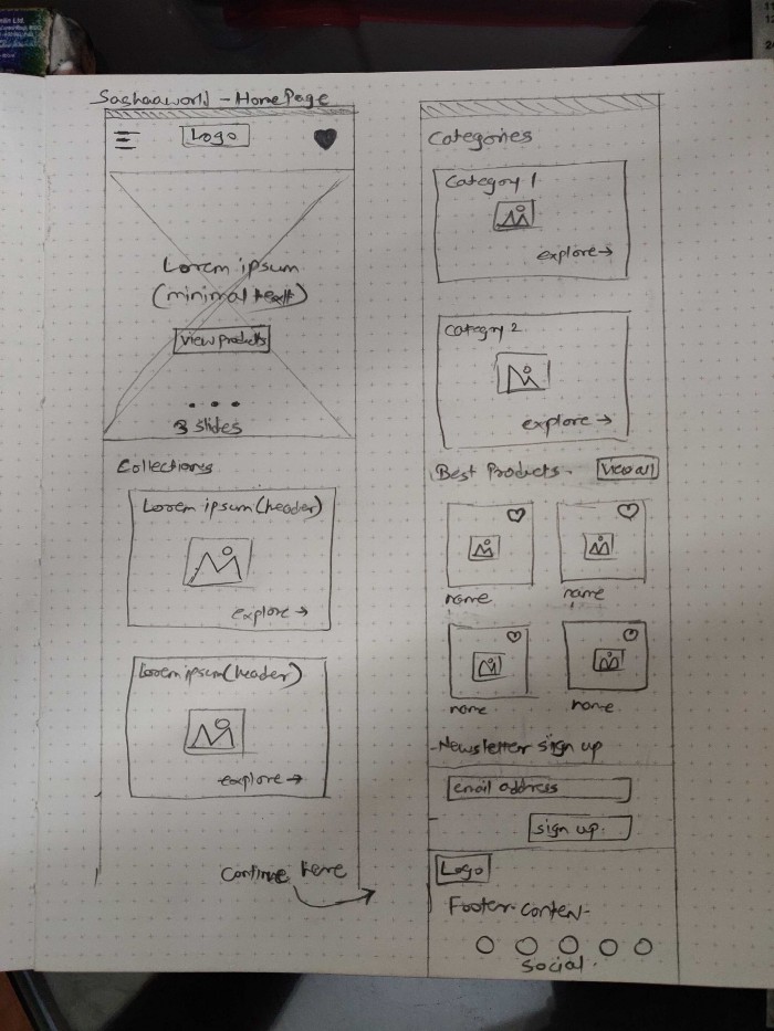
1. Homepage
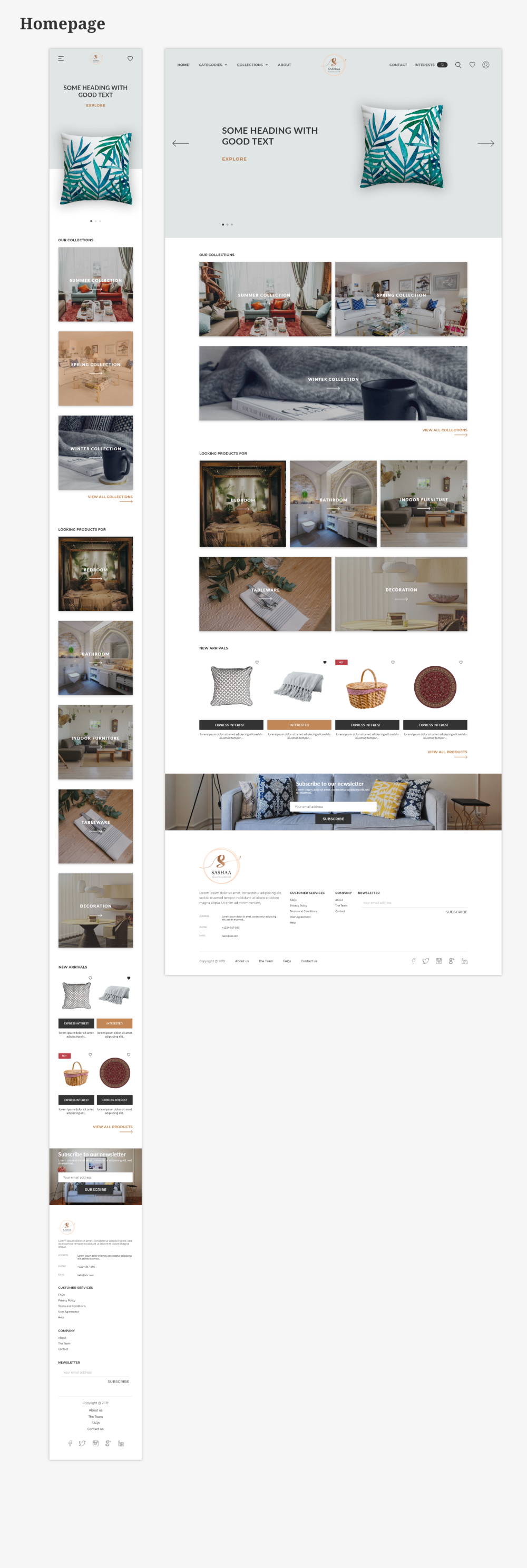
I kept the home page simple, clean and minimal to avoid overwhelm users with flood of information and too much products. I’ve also given global search navigation to find products easily. New arrivals section helps user to identify the latest trends the Sashaaworld offers as well as giving users helpful suggestions to buy these products or new arrivals. Keeping all the collections and categories on home page helps user to check out particular collections or category that they chose.
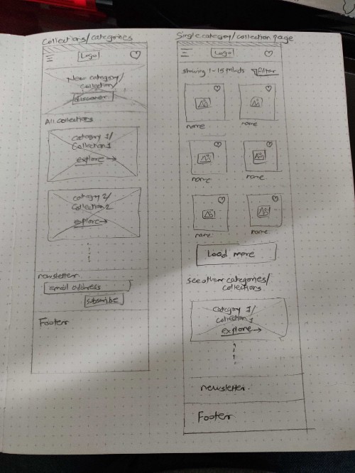
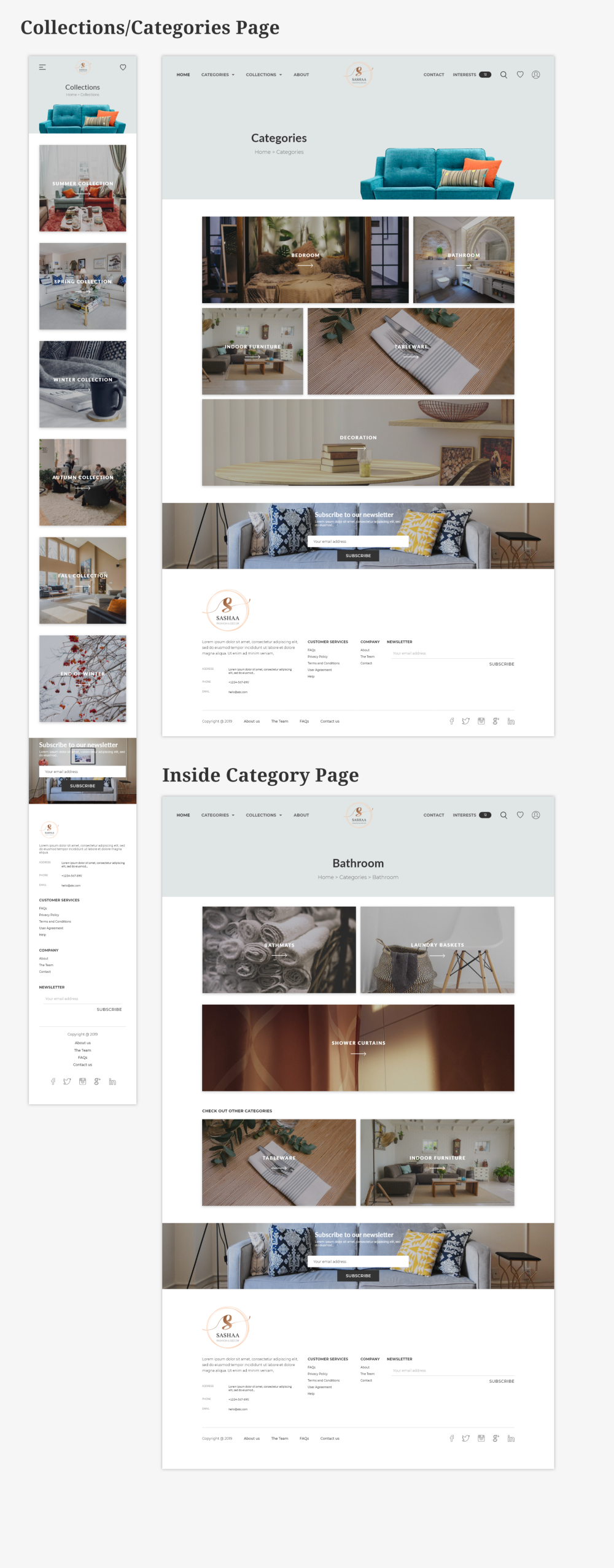
2. Collections/Categories Pages
I’ve provided the both categories and collections sections in the navigation where a user can make a choice to go either one of them. Once a user selects any category, they are brought to the page that lists the sub-categories under the category. As, sub-categories also make an important role to categorize between product range, it was efficient for user to narrow down their product search further.
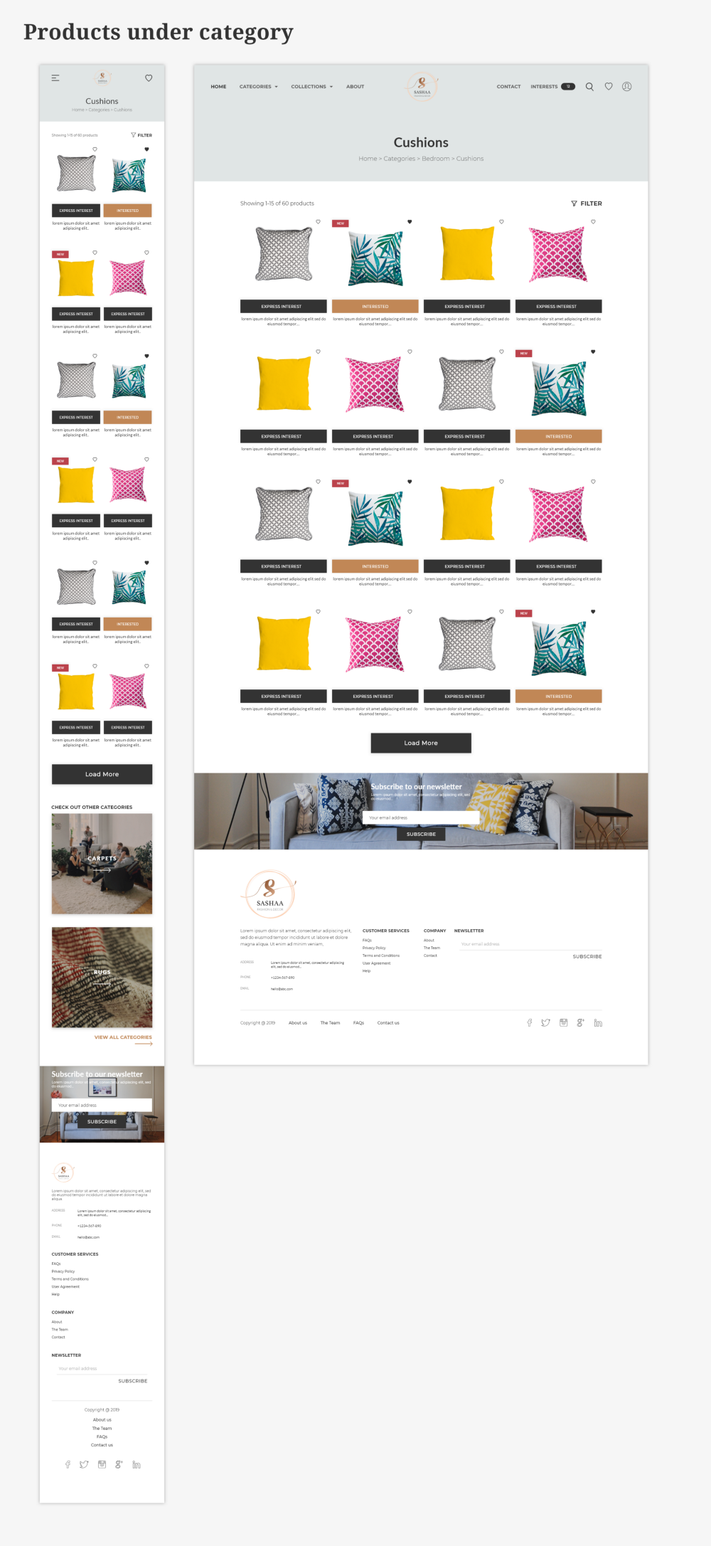
3. Product List Page
Once, the user selects desired category and sub-category, they are brought to the product listing page where the products are showcased with appropriate filters and sorting options in order to make desired search more efficient. One of my user persona wanted products for her grandson, so these filter options and sorting makes user’s search more focused. I also included breadcrumb at the top to make it easy to navigate on the website for the user.
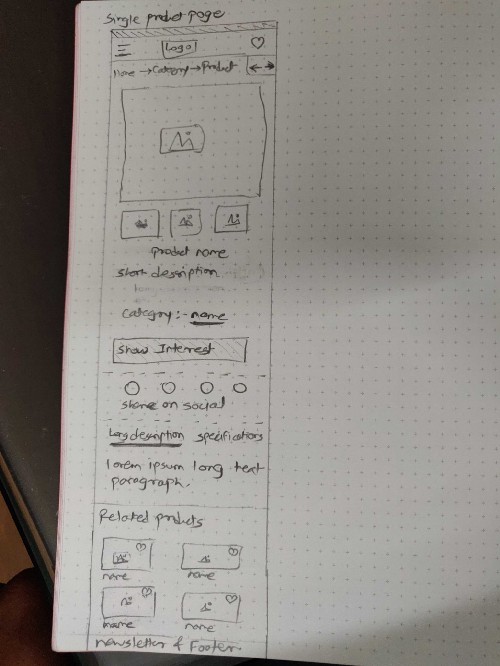
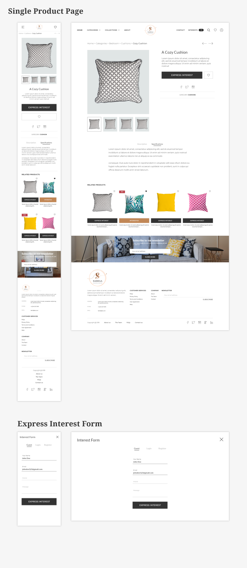
4. Single Product Page
On this page, I wanted to make sure that user gets provided detailed product description so that users can ensure the product fits their needs. The client wanted Express Interest feature before the e-commerce to be introduced. I’ve added express interest form for the users to express their interest in their desired products.
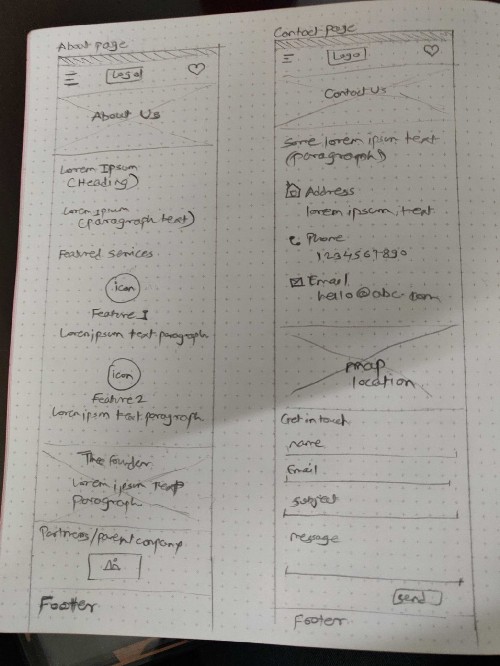
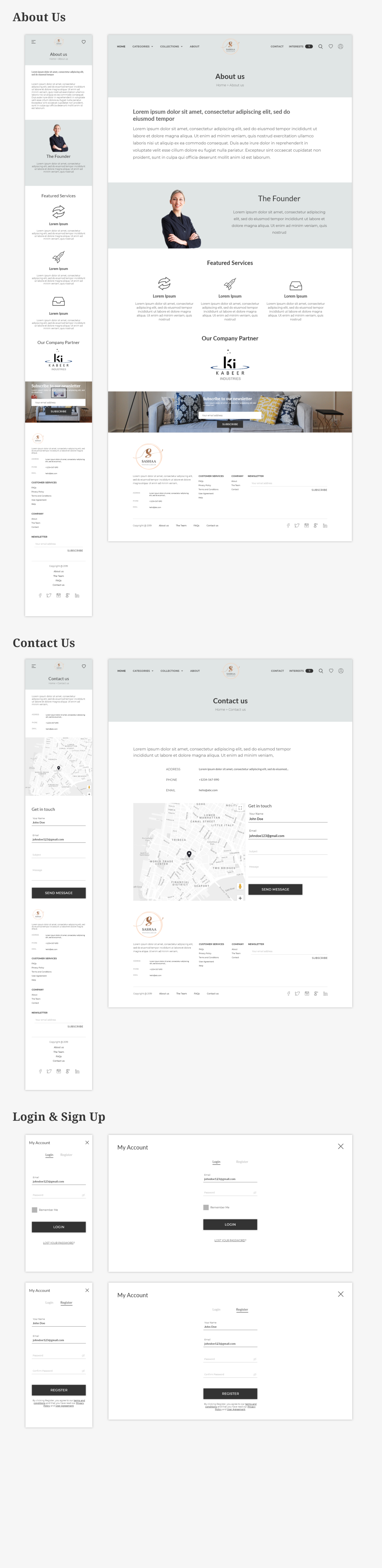
5. Other main pages
Validation
The prototype were made based on the wireframes finalized and it was shared for carrying usability testing. This would allow me to evaluate how users would engage with the proposed solutions and validating whether it was satisfying the primary needs.
I’ve conducted usability with 4 people and have given various micro-tasks to perform on the website design prototype.
Following are some of the important key findings from the tests:
Process of finding a product and heading towards expressing interest was easy and seamless.
Some of the participants wanted to ask the questions related to the express interest process being carried out.
From the above key findings, I’ve provided solution to the users’ questions are being raised on checkout screen by introducing the FAQs on the same page at the bottom about the checkout process. The screens are then tested again.
Conclusion on this Case Study
Designing an e-commerce website for the Indian Furnishing products and again getting it noticed and generating revenue in flood of the e-commerce market was the primary challenge, which I found by overcoming them with the simple, easy, intuitive and fast checkout process and by using the Mobile-First approach as users’ are carrying out shopping related micro-tasks most of the time on their smartphones.
The 5 stage design process is being carried out for this project through iterative user research, analysis, synthesis and carrying out final prototypes that results in providing easy and seamless shopping experience after validating. Currently, I’m working on improving on implementing the 2-stage checkout process without overwhelming users.
Thank you for Reading!
Thank you for giving your time to read this. Much appreciated. Do leave any feedback you feel is necessary. There’s no End of Learning for me.